
Birth of a Logo, in 4 Movements*
*Caution: in keeping with the subject, more musically cheesy jokes ahead. Creating cohesive brand experiences—here is where one begins to wonder if there shouldn't be some limits!
For the past several weeks I've been working on a new logo for Keys To Success, a great piano teaching studio in NYC, and it finally launched today!
Given the occasion, I thought it was the perfect time to give a glimpse into my typical logo design process, and I've boiled it down into four basic "movements."
prelude
At the start of any project, I get to know the client as much as possible. In contrast to their competition, which creates aspirations towards historical/musical greats, Keys To Success centers around the individual student and helps them draw out their inherent potential. To us this meant a more modern, human aesthetic that is still balanced with a sense of quality. It was decided that the entire name should be spelled out within the logo, and we started off with colors that naturally appealed to the founder and also seemed bright and fun for their target audience.
2nd movement
Armed with my client research, I then begin sketching visual ideas, exploring conceptual associations, and finding appropriate fonts within budget so I can investigate any inherent connections within the letterforms.
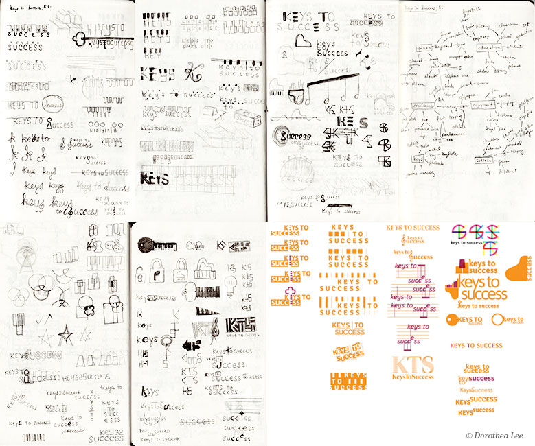
Some initial sketches and ideas
After I've explored various conceptual directions, I narrow down the options to present for review. At this stage, there is limited refinement and the focus is more on the representation of distinct visual ideas and concepts.

First set of different logo directions submitted
Playing with positive and negative space, the "E"s in the name form a piano keyboard. In the lower option (1B), the shape above "Keys" forms the handle of a key whose teeth are piano keys, making the pun of "keys" more explicit. This one was my favorite option.
"Keys To Success" is aligned with an abstracted keyboard, where the blocks above the letters are the black keys and the white keys are hinted at by the placement of the letters and the vertical lines.
The top view of a grand piano's keys also act as an upward-moving bar-graph, with the spine of the "k" lining up as the last bar, illustrating Keys To Success as helping one reach their full potential.
Here, the letters of the font are altered to allude to musical notation without literally being replaced by them. The first "E"=a staff, the first "S"=a treble clef, "UC"=a bass clef. This could have been further emphasized or simplified if it had been chosen.
A multi-perspective view of a stylized black key and two stylized white keys (the left one being pressed), arranged into a tiered winner's platform.
3rd movement
After the first presentation, the client is asked to narrow down the selection to pursue. In this case, Keys To Success liked the first and second direction best, with 1A appealing more to the founder than 1B. Feedback was given on their shapes, spacing, etc., and it was decided that the colors needed to shift to richer and darker tones that better reflected Keys To Success' urban environment and audience.

A snapshot of some color combinations and logo alternatives.
4th movement
At the end of the second round, the final logo direction and color combination is chosen. At this time I go in and adjust the smallest details, from the shapes of the letter C and roundedness in the vertical lines to the perceived spaces between letters so that everything looks properly aligned and evenly spaced (even if mathematically they are not—in designer-speak this is called "kerning").
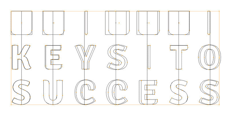
Refinement of letter forms and spacing
The appropriate files for this final version is prepared, along with specific rights for usage, and after final approval is given...
fin!

The logo project is finally complete, and a logo is born!
Did you enjoy looking under the hood at the design process? What are your reactions to the way the logo progressed? Let me know in the comments!